 Add Row
  Add
Add 

Did you know that over 70% of small business websites lack a clear call to action ? This startling statistic reveals just how much untapped conversion potential exists for brands online. Whether you’re crafting a blog post, landing page, or Facebook ad, the right call to action (CTA) is your golden ticket to turning visitors into leads, signups—or sales. In this guide, you’ll uncover proven techniques for making every CTA button and copy deliver results, so you never have to wonder if your next marketing campaign will convert.
Unlocking Conversion Potential: Startling Statistics About Call to Action Performance
Calls to action are the pivot point of every successful digital marketing campaign . A well-placed CTA button can skyrocket your conversion rate, while vague or hidden calls to action leave revenue on the table. For instance, analysis shows that emails with a single, clear CTA increased clicks by 371% compared to campaigns lacking one. Imagine the impact on your email marketing or landing pages if your calls to action were strategically optimized!
Another eye-opening fact: Button color and placement can improve click-through rates by up to 21% . This means small design tweaks with your CTA button can yield measurable results. As you read on, you’ll learn why companies that prioritize strong action verbs and actionable CTA copy see higher engagement—and why now is the time to tailor your CTA strategy for every social media platform, blog post, and website funnel.

A Surprising Fact: Over 70% of Small Business Websites Lack a Call to Action
Despite the proven results strong CTAs produce, most small business websites are missing this critical component . Without a clear CTA, potential customers reach your landing page or product but leave without taking the specific action you want—whether that’s signing up, requesting a free trial, or making a purchase. Addressing this oversight is the simplest step you can take to boost conversion rate, especially when you leverage compelling CTA copy and engaging button designs that grab instant attention.
By understanding just how influential an effective call to action is, you position your business to capture every potential customer. The lack of CTAs leaves users wandering, but a strategic prompt guides them to the desired action. Throughout this article, you’ll find actionable examples of CTA designs and copywriting to ensure your offer is never overlooked.
Why Addressing Your Call to Action Is Crucial for Results
Your call to action is more than just a button at the end of your marketing campaign—it serves as the direct path from passive browsing to an active decision. If your CTA button is unclear, hidden, or doesn’t resonate with your target audience, you risk losing valuable leads at the final hurdle. A clear call to action steers users toward the specific action you want them to take, be it subscribing to a blog post, exploring a time offer, or clicking through a Facebook ad.
With competition for attention fierce on every platform, tailoring your CTA to your target audience and medium is vital. The right message drives engagement and maximizes ROI, while a weak CTA leaves even the best content or offer invisible. Invest now in optimizing every call to action, and you’ll see lifts in conversion rate and marketing performance across the board.
How This Guide Will Transform Your Calls to Action
- Discover actionable strategies to write a call to action that delivers higher conversion rates.
- Master every element from cta button design to action verb selection.
- Analyze top cta examples and learn to apply them across social media and digital campaigns.
What Is a Call to Action?

Defining the Term 'Call to Action' and Its Role in Conversion Rate Optimization
A call to action (CTA) is a direct prompt that tells your audience the specific action you want them to take. Found in every impactful landing page, blog post, and social media ad, CTAs can be as simple as “Buy Now,” “Download Free Guide,” or “Subscribe Today.” The purpose of strong CTA copy is always the same: convert passive readers into leads or customers by offering a clear next step.
In the context of conversion rate optimization (CRO) , the call to action is the bridge between user engagement and the ultimate result—be it form submission, making a purchase, or sharing your content. When you select the right action verb and pair it with a visible CTA button, you guide the user’s journey with precision, improving your conversion rate and fulfilling your marketing campaign’s goals.
The Critical Importance of Calls to Action in Digital Marketing Campaigns
Calls to action are the make-or-break element of every digital marketing campaign . Whether embedded in a Facebook ad, email marketing, or on a landing page, a well-crafted CTA crystallizes your value proposition and motivates a specific action. It’s not enough to present a great offer or compelling story; without a clear CTA, your target audience may never know what to do next.
In today’s digital age, CTAs are essential for capitalizing on fleeting attention spans. The right CTA button, designed with urgency and clarity, is the secret weapon for moving users from awareness to conversion. If you want consistent results from your marketing campaigns, investing in effective CTAs is the one improvement guaranteed to pay dividends across every platform.
The Psychology Behind an Effective Call to Action
How Human Behavior Influences CTA Button Engagement
Understanding user behavior is key to designing CTAs that convert. People are naturally inclined to respond to clear direction—especially when a CTA button is prominent and action-oriented. By leveraging behavioral triggers, such as social proof or personal relevance, you can motivate users to click your CTA and complete the desired action. The most successful CTAs simplify the path to decision, minimizing hesitation and encouraging instant engagement.
Additionally, elements like color, wording, and positioning of your CTA button can have dramatic impacts. Research shows that users are drawn toward visually distinct buttons and copy that speaks directly to their goals or fears. In short, understanding your audience’s motivations allows you to tailor your CTA to inspire action and maximize your conversion rate.
Creating a Sense of Urgency: How 'Now' and 'Limited-Time' Offers Drive Action
Nothing accelerates user action like a sense of urgency. Terms such as “Shop Now,” “Limited-Time Offer,” or “Download Before Midnight” inject a psychological deadline, prompting users to act quickly rather than procrastinate. CTAs that incorporate urgency consistently outperform those without—turning time offer prompts into real conversions.
The concept of scarcity (like only a few slots left) or a ticking clock resonates with users’ fear of missing out (FOMO). Creating urgency in your CTA copy, even on a social media campaign or email marketing push, encourages immediate response. Capture this energy in your campaigns to boost results instantly and set your calls to action apart from the competition.
"A powerful call to action turns passive readers into active customers." — Conversion Expert
Key Elements Every Call to Action Must Include
- Strong action verbs
- Compelling cta copy
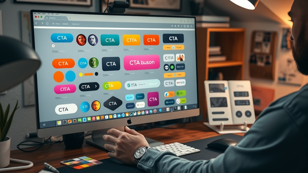
- Visible cta button
- Sense of urgency
- Clear value proposition
- Brand-aligned messaging

How Action Verbs Influence Conversion Rate
The backbone of every effective CTA is the use of action verbs . Words like “Start,” “Get,” “Discover,” and “Reserve” trigger immediate responses in the brain and create a specific action pathway for the reader. CTAs that begin with a strong action verb experience significantly higher engagement levels compared to those with weak or passive language. This makes your cta copy the driving force for nudging users toward your desired result.
Action verbs not only clarify what you want users to do—they add energy and excitement to your marketing campaign. When testing cta examples, experiment with a variety of action verbs to see which resonates with your target audience. Remember, replacing “Submit” with “Get My Free Trial” (for example) can lead to dramatic improvements in conversion rate.
Color and Placement: Optimizing the CTA Button for Maximum Results
Your CTA button should never blend into the background. Use contrasting colors that align with your brand but stand out visually, making the button easy to spot at a glance. Strategic placement—such as above the fold on a landing page or at pivotal moments in a blog post—ensures users always have a next step without having to scroll.
Test different colors and locations for your CTA button to see what works best with your audience. For example, red and orange buttons often increase feelings of urgency, while blue inspires trust. Placement is equally crucial; if your CTA is hidden or buried, your conversion rate will suffer. Adapt placements to the context, whether in email marketing, Facebook ads, or mobile views, for the highest impact.
Types of CTA: Choosing the Right Call to Action for Your Goals
| CTA Type | Purpose | Typical Use | Recommended Action Verbs |
|---|---|---|---|
| Lead Generation | Capture contact info for future engagement | Landing pages, pop-ups, blog posts | Download, Subscribe, Register |
| Sales | Prompt immediate purchase | Product pages, checkout flows | Buy, Shop, Add to Cart |
| Social Media Encouragement | Drive sharing or following | Posts, stories, ads | Share, Follow, Like |
| Event Registration | Maximize event signups | Webinars, conferences | Register, Save Your Spot |
| Download Offer | Distribute valuable content | eBooks, whitepapers, resources | Download, Access |
| Contact Prompt | Encourage direct communication | Contact pages, support forms | Contact, Get Help |
Standalone vs. Integrated Calls to Action: When to Use Each Type
Standalone CTAs —like buttons on a landing page—are direct, easy to spot, and push for an immediate response. These are best for single-focus outcomes, such as grabbing a free trial or making a purchase. Integrated calls to action , however, are woven into blog posts, emails, or throughout a marketing campaign, providing opportunities at multiple stages for users to act. Use these for nurturing and guiding potential customers step-by-step to conversion.
Choosing between standalone and integrated CTAs depends on your objective. For high-converting landing pages or Facebook ads, direct standalone buttons are best. If your campaign involves longer-form content or email journeys, integrated CTAs keep readers engaged and moving through your funnel before presenting the final action example you want them to take.
Examples of CTA for Social Media, Facebook Ads, and Landing Pages
On social media , short, punchy CTAs grab attention—think “Swipe Up,” “Learn More,” or “DM Us Now.” For a Facebook ad , the CTA copy might focus on value—such as “Get 20% Off Today” or “Claim Your Spot.” On a landing page, actionable CTA buttons like “Start My Free Trial” or “See How It Works” prompt immediate engagement by aligning with user intent and making the next step crystal clear.
Take inspiration from a variety of cta examples and test them across your channels. What works on a product page may not suit a social feed; adapt every call to action to the context for optimal results, ensuring you always address the needs and psychology of your unique target audience.
CTA Copywriting Techniques That Drive Results
Word Choice: The Power of Action Examples and Action Verbs
The secret to memorable cta copy is precise language. Start with energetic, clear action verbs such as “Join,” “Discover,” “Unlock,” or “Start.” Pair these with a specific benefit or outcome , such as “Unlock Your Savings” or “Start Your Free Trial.” Action examples like these not only tell users what to do, they reveal the value they’ll receive, increasing conversion rate substantially.
Be sure to focus your copy on the user—not the business. “Get My Guide” feels personal and actionable compared to generic requests. When in doubt, refer to real-world cta examples for proven structures, and adapt your language to suit your target audience and their needs.

Testing CTA Copy for Optimal Conversion Rate
Even the best CTA copy can be improved. Test different action verbs, benefit statements, and urgency cues using A/B split testing to find the highest-converting combinations for your audience. Swap “Get Started” with “Start Saving Now,” or test “Claim Offer” against “Unlock Discount” to see which drives more results.
Monitor metrics such as click-through rates, bounce rates, and conversions. Each test reveals insights about user behavior and preferences, allowing you to continually refine your calls to action for maximum impact across all marketing campaigns.
Best Practice Examples of Call to Action

High-Converting CTA Examples from Top Brands
Top-performing brands use CTAs such as “Shop the Collection,” “Try Free for 30 Days,” or “Subscribe & Save” to connect with their target audience instantly. These examples use concise action verbs and clear value propositions to drive immediate action. Look to leaders in your industry for inspiration and adapt their successful strategies to your unique voice and brand positioning.
Well-crafted cta buttons are always visually distinct and centered around a compelling reason to act. Examine your favorite products or services online, and notice how every landing page or email campaign includes a clear, irresistible call to action—copy these principles to see a boost in your own conversion rate.
Case Studies: How Tweaking Your Call to Action Increases Results
A leading SaaS provider increased trial signups by 25% after changing their CTA button from “Start” to “Start Free Trial.” An e-commerce brand saw abandoned cart recovery rise by positioning “Complete My Purchase” above the fold. These case studies prove that even minor tweaks—be it changing an action verb, CTA color, or urgency level—can deliver measurable improvements in results across every channel.
The key lesson? Never settle for “good enough.” Consistently monitor, test, and iterate on your CTA designs and copy to stay ahead of competitor offers and maximize every campaign’s potential for conversion rate growth.
"The difference between a good CTA and a great CTA is understanding your customer’s mindset."
Designing the Perfect CTA Button
Choosing Colors and Shapes for Maximum Impact
An effective CTA button is more than just words—it’s a visual signal calling your audience to act. Contrasting colors, rounded corners, and sufficient size all enhance visibility. Popular brands often use orange, green, or blue to inspire urgency and trust. Shapes matter too: bold rectangles tend to command more attention compared to subtle outlines.
Match your button’s aesthetic to your brand while ensuring it stands out on every page. Remember, the goal is to create a clear CTA that’s impossible to miss, no matter where it appears in the user journey. Test color and shape combinations regularly to find the approach that delivers the highest conversion rate for your audience.
Responsive CTA Buttons: Ensuring Conversion Across Devices
Your audience isn’t just browsing on desktops—more than half of web traffic comes from mobile devices. A responsive CTA button adapts its size, color, and placement for maximum tap-ability and visibility on every screen. Failing to optimize CTAs for mobile can lead to missed conversions and poor user experiences.
Test all CTAs across device types to ensure that buttons remain prominent and functional, whether viewed in a Facebook ad swipe-up, a mobile landing page, or an Instagram story. Mobile-first design principles dictate generous sizing, thumb-friendly positioning, and clear copy to prevent users from missing your main selling point.
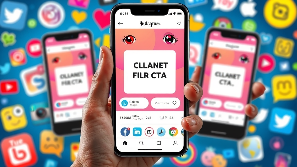
Calls to Action in Social Media: Maximizing Engagement
Leveraging Social Media Calls to Action for Viral Growth
On social media , CTAs are the spark that turns passive scrolling into viral activity. Use active verbs and engaging prompts like “Tag a Friend,” “Share to Win,” or “Vote in Our Poll.” These action examples encourage sharing, liking, and commenting—expanding your reach and amplifying your campaign’s success.
Social CTAs must fit each platform’s unique culture and constraints. Instagram Stories favor swipes and taps, while Facebook posts call for clicks or shares. Tailor your call to action to each context, and you’ll see your engagement—and conversion rate—rise across all channels.
Adapting CTAs for Facebook Ads, Instagram Stories, and More
Different platforms require adapting your CTA approach. Facebook ads thrive with personalized offers like “Learn More” or “Sign Up Instantly.” Instagram Stories, with fleeting attention, benefit from phrases such as “Swipe Up” or “Tap for Details.” Each unique environment demands a clear, actionable directive attuned to how users interact with content on that platform.
By understanding where, when, and how users engage, you can align your CTA button and copy accordingly. This ensures your call to action always meets users with relevance and clarity—whether you’re driving sales, downloads, or followers.
How to Measure and Improve CTA Conversion Rate
Key Metrics to Monitor for Effective Calls to Action
Analyzing performance helps you identify what works and what needs adjustment. Key metrics include: click-through rate (CTR), conversion rate, bounce rate, and time on page. In platforms like Google Analytics, heatmaps can show how users interact with your CTA button, revealing scroll behavior and engagement patterns.
Monitor these statistics regularly to optimize your CTA strategy. High bounce rates may reveal unclear offers, while low CTR highlights issues with button design or placement. Each metric supplies valuable insights into user behavior and conversion performance.

A/B Testing CTA Button Designs and Placement
Never settle for guesswork. A/B testing is essential for identifying which CTA copy, color, or placement achieves the highest conversion rate with your target audience. By running real-time experiments—such as comparing “Get Started” against “Start Now,” or moving your button higher on the page—you gather concrete data to inform your next marketing campaign.
Remember: what works for one brand or audience may not work for another. Continually test, adapt, and learn so your calls to action evolve with changing user preferences and competitive landscapes.
Common Pitfalls That Hurt Conversion Rate—and How to Avoid Them
The biggest mistakes with call to action strategy include using vague or weak action verbs , hiding your CTA button, ignoring mobile experience, and failing to create a sense of urgency. Avoid placing CTAs too far down the page or burying them in dense content. Weak cta copy misses opportunities by not making the offer or value clear.
To overcome these pitfalls, always test placements and copy , use strong action verbs, add urgency where appropriate, and optimize for mobile users. Every adjustment makes it easier for your potential customer to complete your desired action—resulting in a better conversion rate for your site or campaign.
Real-World Action Examples: What Works in Practice
- “Start Your Free Trial”
- “Download the Guide Now”
- “Get 10% Off Today”
- “Subscribe & Save”
- “Join Our Community”
- “Shop the Sale”
- “Book Your Spot”

Recharge Your CTAs: Action Examples for Every Industry
Whatever your sector, you can find CTAs tailored to your goals. For SaaS: “Start Free Trial.” For e-commerce: “Add to Cart” or “Shop New Arrivals.” For education: “Download Syllabus.” For events: “Save Your Seat.” Even in non-profits, “Donate Now” creates a clear path to action. By customizing your calls to action with industry-specific language and urgency, each CTA becomes more persuasive and relevant, maximizing conversion opportunities.
Don’t stop with one action example—develop a list, then test and refine to find what resonates. Whether you’re running a blog post, email campaign, or paid ad, a tailored call to action switches passive interest into active engagement for every audience you meet.
People Also Ask: Essential FAQs About Call to Action
What is a call to action example?
A call to action example is a direct prompt on a website, ad, or email telling the user exactly what to do next. For instance, “Sign Up for Free,” “Get My Guide,” or “Book Now” are all CTAs that encourage a specific desired action tailored to the audience’s needs.
What is the meaning of call of action?
A call to action refers to any message or button designed to push the reader, viewer, or user to take a specific, immediate step—such as making a purchase, subscribing, or requesting information—ultimately supporting your marketing campaign goals.
What is call to action in writing?
In writing, a call to action is the sentence or phrase that tells the reader what they should do next. It could appear at the end of a blog post, in an email marketing campaign, or within content—guiding the reader from information to action, like downloading a resource or joining a list.
What are the 6 areas of call to action?
The six key areas are: 1) Using strong action verbs, 2) Writing compelling cta copy, 3) Ensuring a visible cta button, 4) Creating a sense of urgency, 5) Providing a clear value proposition, and 6) Aligning messaging with your brand for a consistent, effective user experience.
Building Your Own High-Converting Call to Action: A Step-by-Step Template
Select the Right Action Verb and CTA Copy
Begin by selecting a strong action verb that aligns with your desired result—such as “Download,” “Register,” or “Shop.” Pair this with concise, audience-focused CTA copy that highlights a benefit, such as “Download Your Free Guide” or “Join the Community Now.” Tailor your message to your target audience’s values and pain points for maximum effectiveness.

Craft a Visual CTA Button That Stands Out
Design your CTA button to pop from the page using contrasting colors, large font, and prominent placement. Add padding and visual hierarchy so there’s no chance users miss it. Remember, the clearer the button, the higher the conversion rate.
Create a Sense of Urgency With Your Messaging
Incorporate urgency cues like “Limited-Time Offer,” “Act Now,” or “Only a Few Left” in your CTA copy. This motivates potential customers to act quickly, improving conversion rates across all platforms—from landing pages to Facebook ads.
Test, Analyze, and Refine — Boost Conversion Rate Over Time
Constantly A/B test different CTA copy, designs, and placements. Use analytics to identify what works, and refine your strategy for continual improvement. Successful calls to action evolve alongside audience preferences and digital trends.
| CTA Building Block | Examples | Best Action Verbs | Benefits/Best Design Practices |
|---|---|---|---|
| Copy | “Start Free Trial”, “Download Ebook”, “Shop the Sale” | Start, Download, Shop, Claim | Highlight value/urgency |
| Button | Large, rounded corners, vibrant color | N/A | Visibility and ease of click/tap |
| Urgency | “Now”, “Today”, “Limited-Time” | Act, Grab, Reserve | Triggers action and FOMO |
| Placement | Above-the-fold, end of content | N/A | Ensures user can always act |
Expert Insights: Quotes on the Power of a Great Call to Action
"A well-designed CTA button is the cornerstone of online marketing success." — Industry Leader
"If you want users to act, tell them exactly what you want—then make it easy to do so."
Most Frequent Mistakes to Avoid With Calls to Action
- Using vague action verbs
- Hiding the CTA button
- Ignoring mobile optimization
- Lack of urgency
- Poor placement
- Weak copy
Frequently Asked Questions About Call to Action
- What is the ideal length for CTA copy? Brevity is key. Aim for 2–6 words—enough to direct action and explain value concisely, while keeping the message scannable and memorable.
- What color performs best for CTA buttons? High-contrast colors such as orange, green, and blue generally perform best. The real answer depends on your site's color palette and which hues stand out the most.
- How should I test different calls to action? Use A/B split testing platforms to experiment with copy, button styles, and placement. Measure click and conversion rates to determine what works best for your audience.
Watch our step-by-step walkthrough on how to design, test, and optimize your CTA buttons—packed with live examples and actionable tips for every channel.
Get actionable insights with our case-study video, featuring breakdowns of top-performing CTAs and what makes them succeed in real business environments.
Recap and Your Next Steps for Better Calls to Action
- Assess your current CTAs
- Apply proven design and copy techniques
- Test for better conversion rate
- Innovate with action examples
Ready to turn every visitor into a customer? Start optimizing your calls to action today—focus on testing copy, button design, urgency, and placement. Success awaits.
Sources
- Unbounce – https://unbounce.com/conversion-rate-optimization/call-to-action-examples/
- HubSpot – https://blog.hubspot.com/marketing/call-to-action-examples
- Neil Patel – https://neilpatel.com/blog/button-color/
- WordStream – https://www.wordstream.com/blog/ws/call-to-action
Crafting an effective call to action (CTA) is essential for guiding your audience toward desired actions, such as making a purchase, signing up for a newsletter, or downloading a resource. A well-designed CTA can significantly enhance your conversion rates and overall marketing success.
Key Elements of an Effective CTA:
-
Use Strong Action Verbs: Begin your CTA with compelling verbs like “Shop,” “Order,” “Subscribe,” “Add,” “Claim,” “Sign Up,” “Get Started,” “Purchase,” “Join,” or “Upgrade” to prompt immediate action. ( grammarly.com )
-
Create a Sense of Urgency: Incorporate time-sensitive language such as “now,” “today,” or “limited-time” to encourage prompt responses. For example, “Order Today” or “Claim Your Discount Now.” ( grammarly.com )
-
Highlight Benefits: Clearly communicate the value or benefit the user will receive. Phrases like “Unlock 20% Off” or “Get Instant Access” make the advantage explicit. ( squarespace.com )
-
Ensure Visibility: Design your CTA button to stand out by using contrasting colors and strategic placement. Positioning the CTA prominently on the page increases the likelihood of user engagement. ( smashingmagazine.com )
-
Personalize When Possible: Tailor your CTA to resonate with your target audience. Personalized CTAs can perform significantly better than generic ones. ( digitalsilk.com )
Examples of Effective CTAs:
-
Dropbox: Utilizes a clear CTA like “Find the Plan for You,” guiding users through a personalized selection process. ( rockcontent.com )
-
Evernote: Features a straightforward “Sign up for Free” CTA, emphasizing ease of access and immediate value. ( rockcontent.com )
-
Stitch Fix: Engages users with “Take Your Style Quiz,” offering an interactive experience that personalizes the shopping journey. ( rockcontent.com )
By integrating these elements into your CTAs, you can effectively guide your audience toward desired actions, enhancing engagement and boosting conversion rates.


Write A Comment